Headers
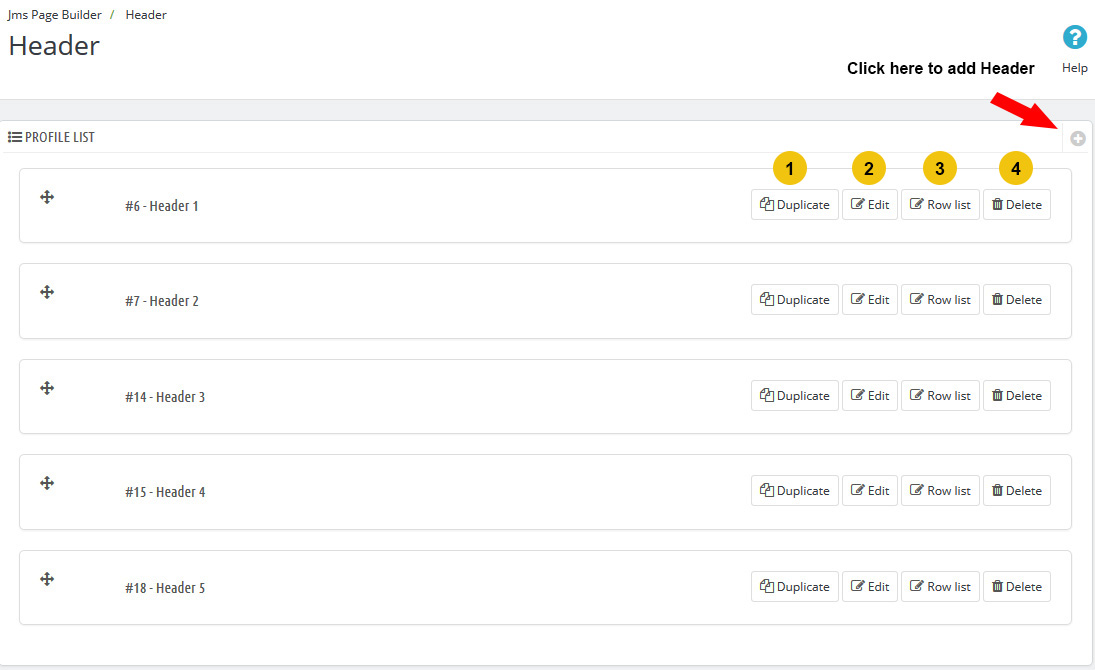
Go to Backend > Jms Page Builder > Header
- 1Duplicate Header Profile
- 2Click here to edit Header information
- 3Click here to go to Header Layout Manager
- 4Click here to remove Header
Click to Edit Button on Headers List
- 1Title : Enter Header's Title
- 2Class_suffix : Enter Header's class suffix, use it to style for header.
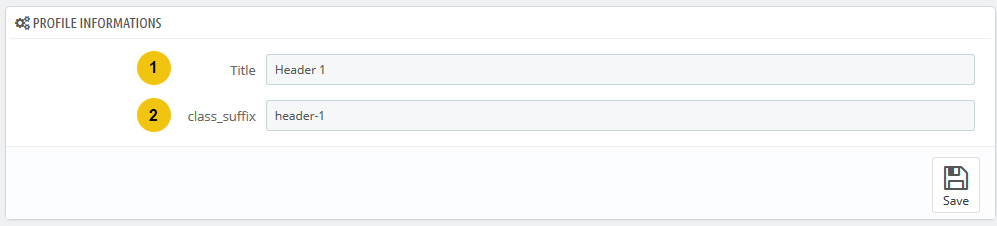
Click to Save Button to save it
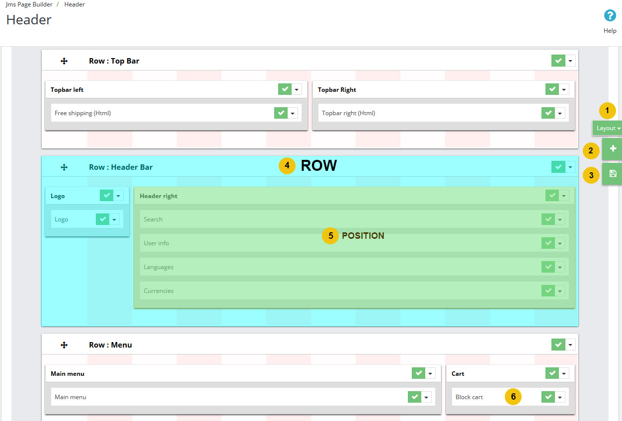
Click to Row List Button on Headers List
- 1Layout Button : Switch Layout it supports 4 layout size : Desktop( >1200px ), Medium Device( >991px ), Tablet( >768px ), Mobile( >320px ).
- 2Add Row Button : Click to add new row for Header.
- 3Save Button : Click to save layout for Header.
- 4Row : Each Header has one or more row. Use Add Row Button to add new Row.
- 5Position : Each Row has one or more Position.
- 6Block : Each Position has one or more Block.
How to Use
- Drap & Drop Row box In Row List to change row order.
- Drap & Drop Position box In Row box to change position order.
- Click to Layout button to choose layout what you want to change grid.
- Hover to right side of position box => scroll to resize position box.
- After resize position box in all layout grid => click to Save Layout Grid to save it.
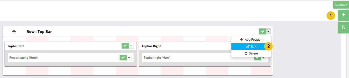
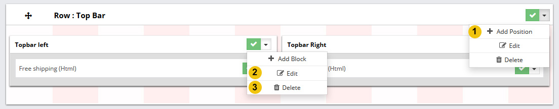
- 1Add Row : Add New Row.
- 2Edit Row : Click to edit Row Information.
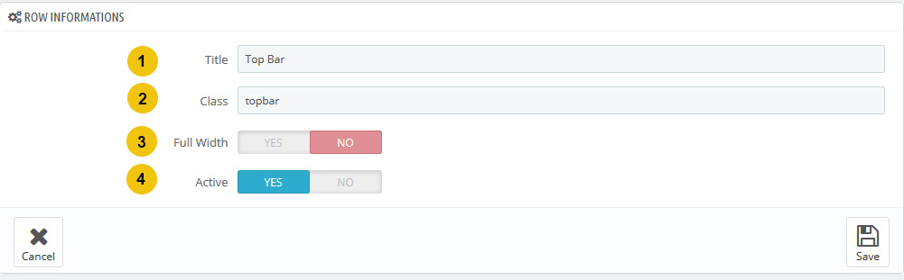
Row Edit Form
- 1Title : Row Title
- 2Class :Row Class Suffix, use to make special style for row.
- 3FullWidth : If "Yes", this row's width will be 100%(full), if "No", positions in row will be store in a "container" div.
- 4Active : Row is Active or 'UnActive', if "UnActive" it will not show on frontend.
- 1Add Position : Click to Arrow Button on Row to see Add Position button.
- 2Edit Position : Click to edit Position Information.
- 3Remove Position : Click to remove the position.
Position Edit Form
In our theme we using css bootstrap framework, Bootstrap grid has 12 columns. So you can select width for position with value 1(1/12 = 8.333%), 2(2/12 =16.666%), 3, 4, 5, 6(6/12 = 50%),7, 8, 9, 10, 11, 12
More about Bootstrap grid : Here
- 1Title : Position Title
- 2Class Suffix :Position Class Suffix, use to make special style for position.
- 3Desktop Width :Position's Width in Desktop (screen >= 1200px).
- 4Medium devices Width :Position's Width in medium devices (screen >= 992px).
- 5Tablet Width :Position's Width in Tablets (screen >= 768px).
- 6Phone Width :Position's Width in Mobile (screen >= 320px).
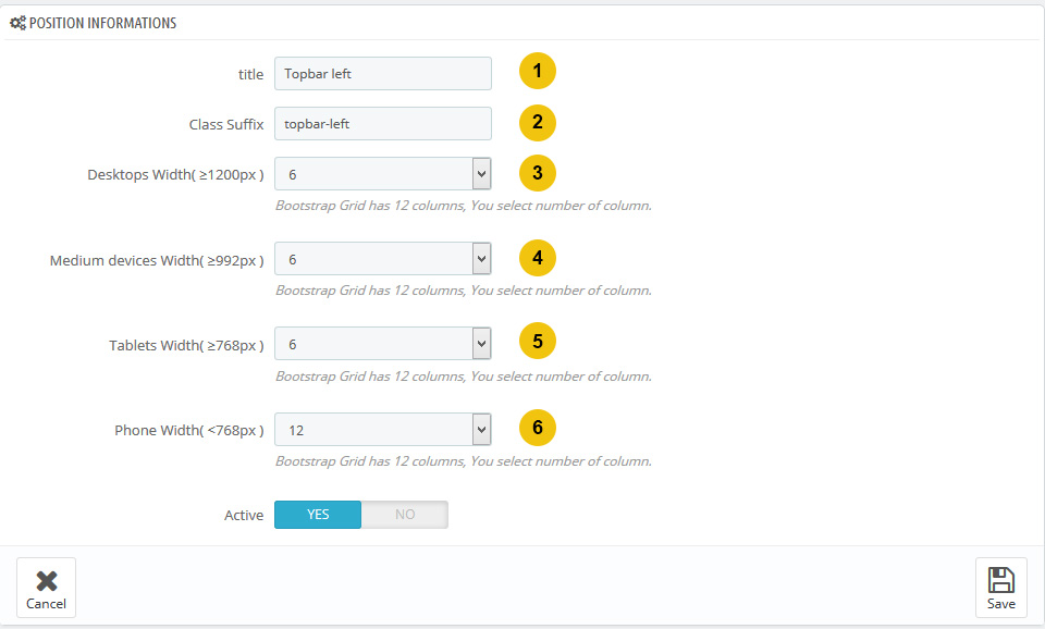
You can easy to change Width of posion for each devices so use layout button in Layout's Header View (Row List View) then Hover to right side of position box => scroll to resize position box.
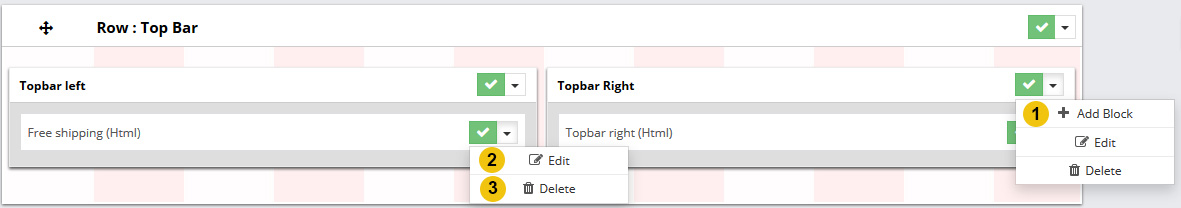
- 1Add Block : Click to Arrow Button on Position to see Add Block button.
- 2Edit Block : Click to edit Block Information.
- 3Remove Block : Click to remove the block.
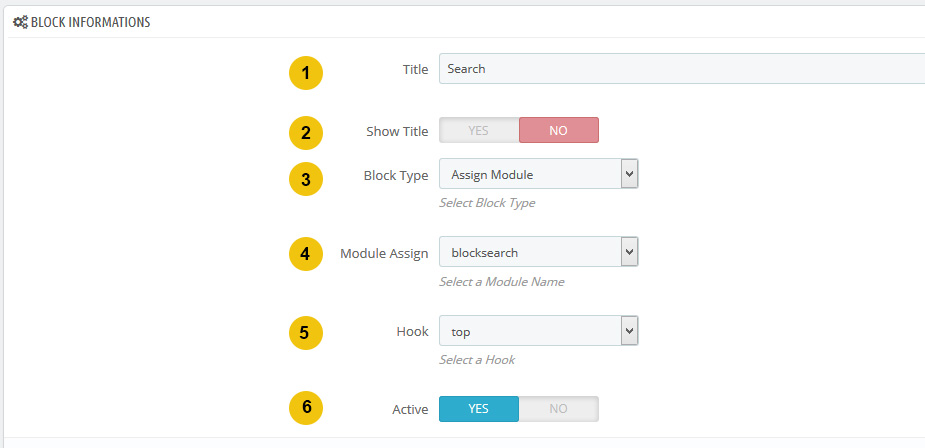
Block Edit Form
- 1Title : Position Title
- 2Show Title : Show or Hide Block Title.
- 3Block Type : It supports 3 type : Custom html(enter html to editor), module assign(select module from list and hook for it), Theme Logo(show theme logo uploaded in backend) .
- 4Module Assign :When Block Type is "Assign Module", this box will be appear for choose Module.
- 5Hook : When Block Type is "Assign Module", this box will be appear for choose Hook.
- 6Active : Active or Unactive, when "Unactive" block will not show on frontend.